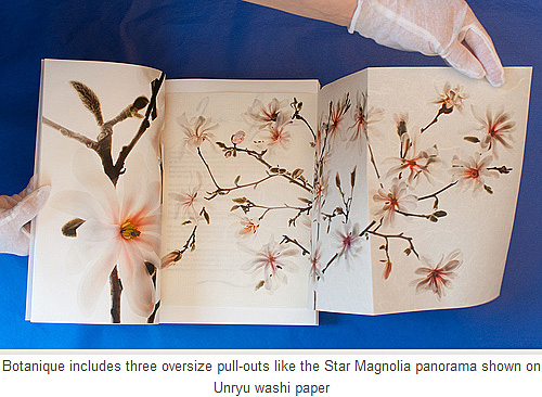
©Harold Davis. All rights reserved.
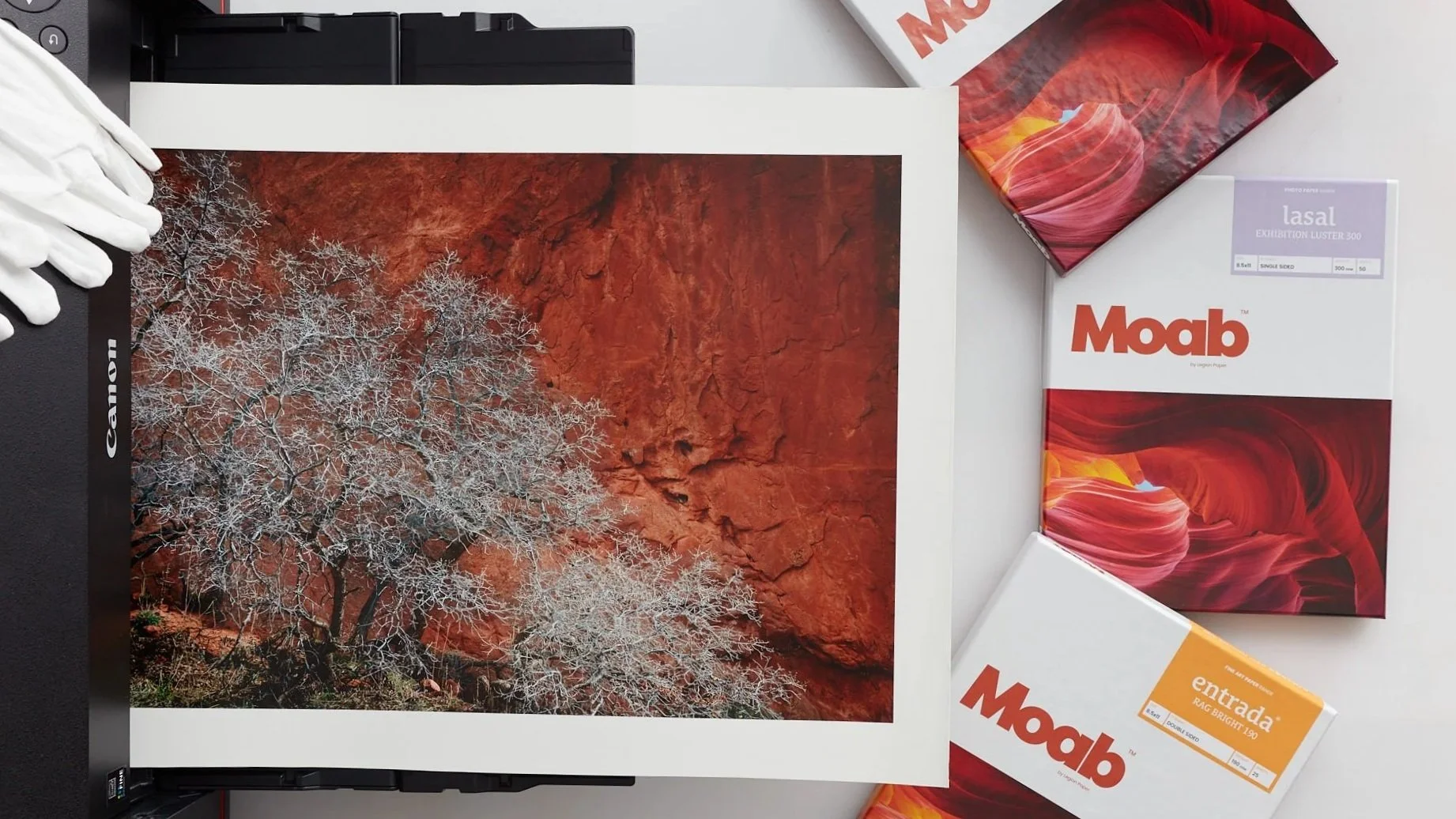
Entrada Rag is the superb, acid-free paper that put the Moab Paper brand on the map some fifteen years ago. So as a Moab Master I was honored to be asked to evaluate and test Moab Entrada Rag Textured, the first addition ever to the Entrada Rag line, during the pre-production stage for the paper. It’s great news for photographers and artists that Moab Entrada Rag Textured is now generally available.
Like the original Entrada Rag Bright and Entrada Rag Natural papers, Entrada Rag Textured is of course acid-free. Also like Entrada Rag Natural, it is a 100% cotton paper that is somewhat warm-toned. This is a very thick sheet (300gsm) with a great sense of “hand” that is entirely OBA free, and (like the original Entrada Rag Natural) boasts an extraordinary tonal and dynamic range for a matte paper. Note that Entrada Rag Textured is single-sided, as opposed to Entrada Rag Bright and Natural, which come both in single-sided or double-sided versions. The tonality of Entrada Rag Textured is much like the creamy feeling of Entrada Rag Natural, rather than the very bright white of Entrada Rag Bright.
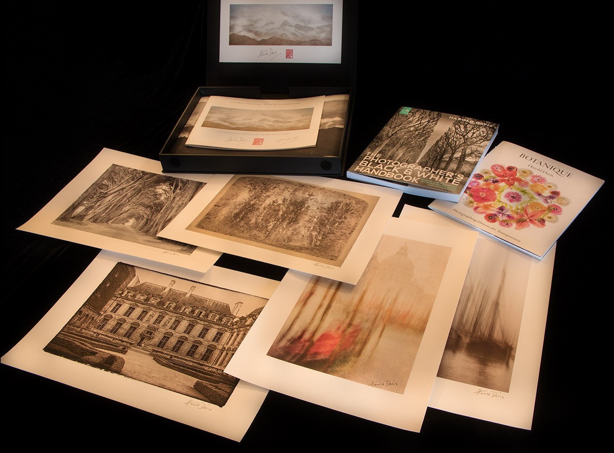
Entrada Rag Textured has become one of my favorite go-to printmaking substrates. © Harold Davis
As you might expect, the primary difference between Entrada Rag Textured and the original Entrada Rag Natural is, of course, the texture of the surface. But what you have here is an elegant, refined texture---not an over-the-top "watercolor" paper.

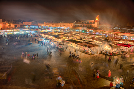
(Above) This image is a long exposure made from a moving Venetian vaporetti. In post-production I lightly texturized it. The blend of the texture and the Entrada Rag Texture helps create a unique and subtle effect. © Harold Davis
Just as the warm-toning of the Entrada Rag Natural paper is subtle, the texture that Entrada Rag Textured presents is also subtle. Photographs printed on Entrada Rag Textured will look like art, and the finished print will be a delight to handle as well as to look at. In other words, Entrada Rag Textured charts a middle "Goldilocks" course: textured, but not too textured. It is a paper that is indeed "just right", and makes the image look great, not a paper that is so "too-too" that the presentation becomes about the paper rather than the photo.
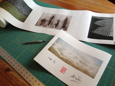
Of course, like any high-end specialty paper designed for modern photographic printing, Entrada Rag Textured is not one size fits all. It works better with some kinds of images than others. To get a sense of the kinds of images that really "marry" well with Entrada Rag Textured, and to learn what this paper does best, we made numerous test prints in my studio using my large format printer.
One thing I found is that this is a paper that really works well as part of the print presentation. In other words, I would never print right up to the bleed-line (edge) with Entrada Rag Textured. It makes much more visual sense to allow the paper to show around your image---and to strongly consider the imposition and spacing of the print on the paper as an integral part of printing-making with Entrada Rag Textured. Showing an inch or two (and sometimes more!) of Entrada Rag Textured around the borders of any image enhances the art print and gallery effect of this paper.

To emphasize the antique look in this print I added a border before printing it on Entrada Rag Textured. © Harold Davis
The combination of a moderate warm tone, refined texture, and high dynamic range is a pretty spectacular set of characteristics for any paper, and helps to make Entrada Rag Textured a winner that is appropriate for a wide range of images. Of course, it is not, never will be, and should not be used like you would use a more glossy photo paper (glossy papers with a more "photographic" finish of course have a great place of their own in the world). So in my experience, the images that work best with Entrada Rag Textured are artful, and intended as art (as opposed to, for example, journalistic-style imagery).
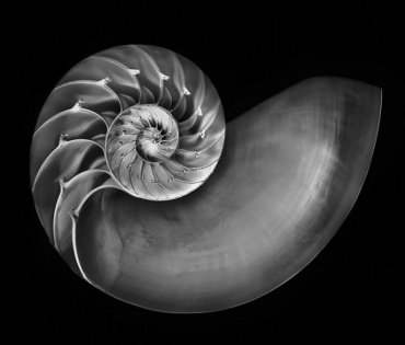
With monochromatic imagery, I would strongly consider toned or somewhat old-fashioned photos (as opposed to "straight" black and white) for Entrada Rag Textured.

The subtle mid-tones of this photo of a row of cypresses is a great match for the ability Entrada Rag Textured has to render subtle tonal gradations. © Harold Davis
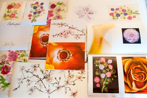
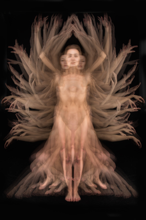
With color imagery, I get great results essentially across the gamut of landscape photography, particularly in imagery where the real strength is in separation of mid-tones. My personal preference on Entrada Rag Textured is for color imagery that has elements that echo antiquity, and so lie in the cross-roads between modernism and older traditions of printmaking and art.

There’s no doubt in my mind that Entrada Textured Rag has become one of my "go-to" printmaking substrates. Combining high quality reproduction with a sensitive and sensuous surface that is entirely fiber, I expect to be making prints with Entrada Rag Textured for a long time to come.
(Left) The rendering of the structure underneath the Art Deco Yaquina Bay Bridge in Oregon is a good fit for Entrada Rag Textured: the paper shows and holds details, even in the areas that are almost black. The paper handles ink well and doesn’t overload, even in very dark areas. © Harold Davis